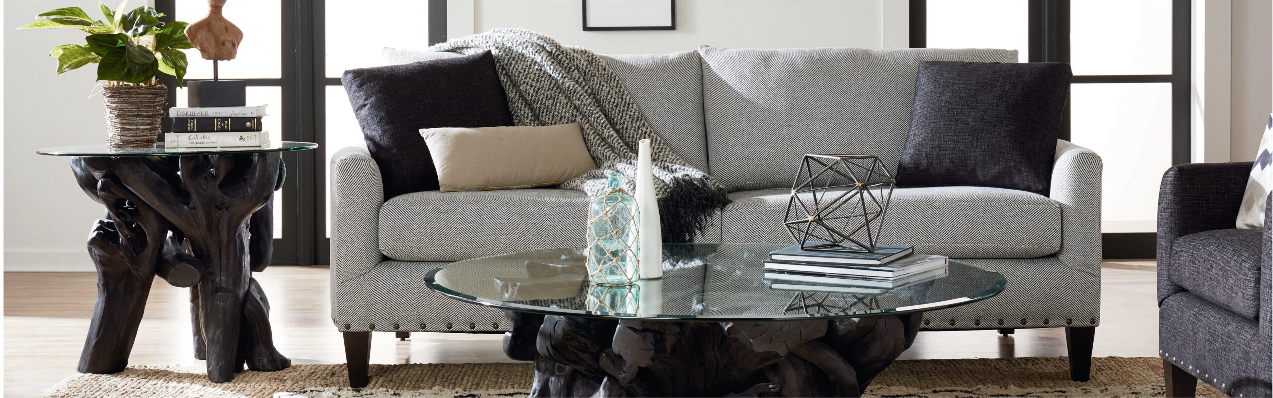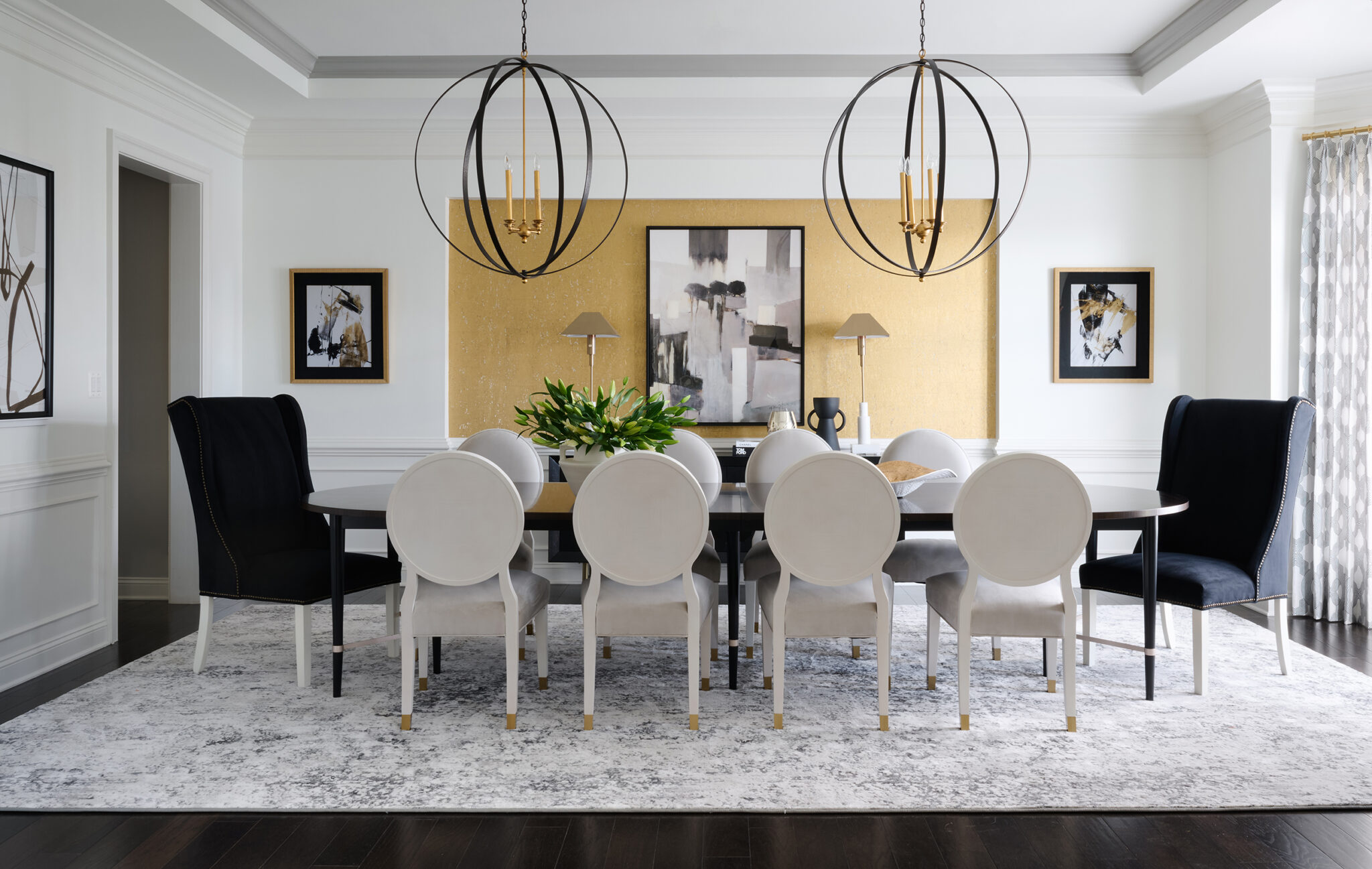
Are you redecorating the dining room? Start with the foundational aspects of the space. Then, developing a suitable color scheme for wall-coverings can help turn a dated room into a chic and inviting place. If you have trouble navigating between certain hues, have no fear – we’ve created a list of colors to consider and ones to avoid while decorating your dining room.
We recommend contacting Michelle Jett – Decorating Den Interiors, before starting. We can help you make the best decision based on your personality and your vision for the space. There’s nothing worse than covering your walls and then deciding it was just wrong!
Consider these color suggestions when deciding on wall-coverings for your dining room:
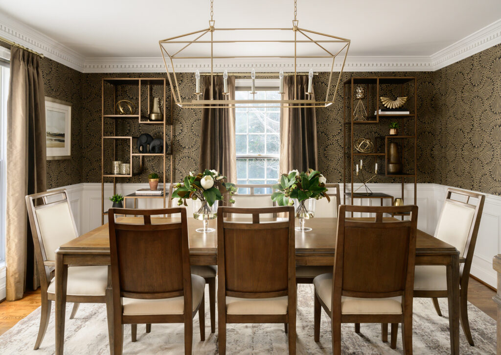
Truffle brown
If you’re working with a variety of wooden furniture in the dining room, This Old House recommends truffle brown to harmonize the space.
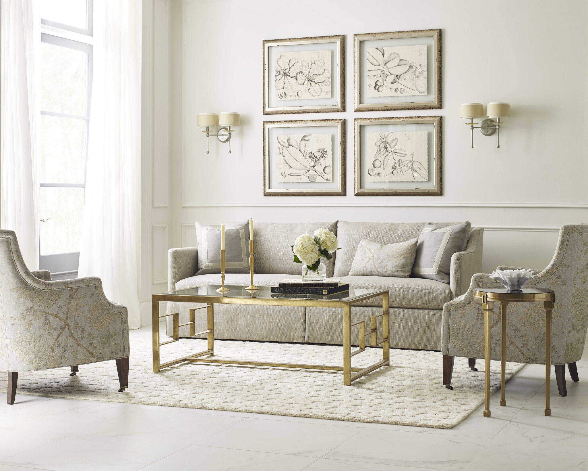
Neutral gray
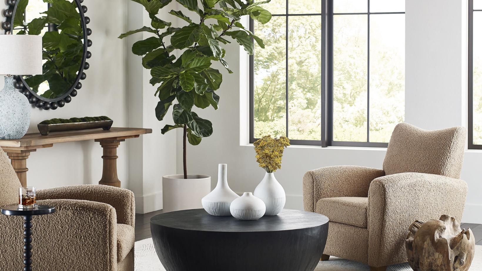
A semi-deep shade of gray makes the perfect canvas for the room – you can decorate it with vibrant accessories to create an abstract masterpiece out of the dining area. Gray remains the new neutral and the “in” backdrop color.
Soft yellow
Soft shades of yellow have a way of creating a warm and inviting living space. Dining room walls in this hue make for an elegant and welcoming touch.
Apple green
Crisp, soft green hints at subtle energy, bringing life to a once-dull room without going overboard.
Now, consider the ones you should be avoiding as well:
Most shades of blue
According to Color Matters, shades of blue can suppress your appetite – which isn’t an ideal feeling to collect in a room built for dining.
Pastel pink
You may see some vintage inspiration coming back into the kitchen with shades of pink, but keep that from spilling over into the dining area. Even a subdued pink is a bold statement and tends to create an uninviting space.
Orange popsicle
Think bright oranges, like a popsicle or freshly-carved jack-o-lantern. Interior designer Heather Humphrey told House Beautiful that this shade tends to evoke the “wow” factor but in an unappealing way.
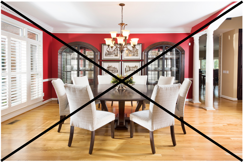
Poppy red
Bright red shades are known as anger-inducing colors. It creates a high-alert environment, so keep this shade away from where you’ll host inviting family and friend get-togethers.
Now that you have a selection of shades and hues to choose from, it’s time to get in touch with us! We will come to your home for a free consultation to assess your dining room and offer decorating insight and expertise based on your space. With this assistance, you can choose the perfect wallcovering and create a gathering space you and your guests will love spending time in.
Now’s the perfect time to make some renovations. So don’t hesitate to contact one of our excellent personal decorators today!