Every year, major paint companies and Pantone, the mecca of all things color, choose a hue that they see being the focal point of their color collections as the calendar switches over, and this year is no exception. These color choices are made by design experts who use their knowledge to predict what pigment will take the cake as the most popular home color for the next 12 months.
Although not every color will be your favorite, and you won’t be able to add each of these shades to your home’s palette, it’s a good idea to know which shades will be frequently used in 2023. Let’s take a peek at some of next year’s colors.
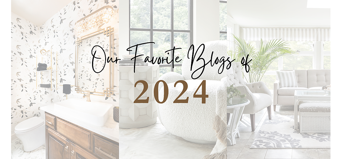
2023 Colors
The colors that are predicted to fill the lives of people all over the country next year are warm, vibrant, and heavily inspired by nature. Here are some of the colors to keep on your radar for integrating into your home design:
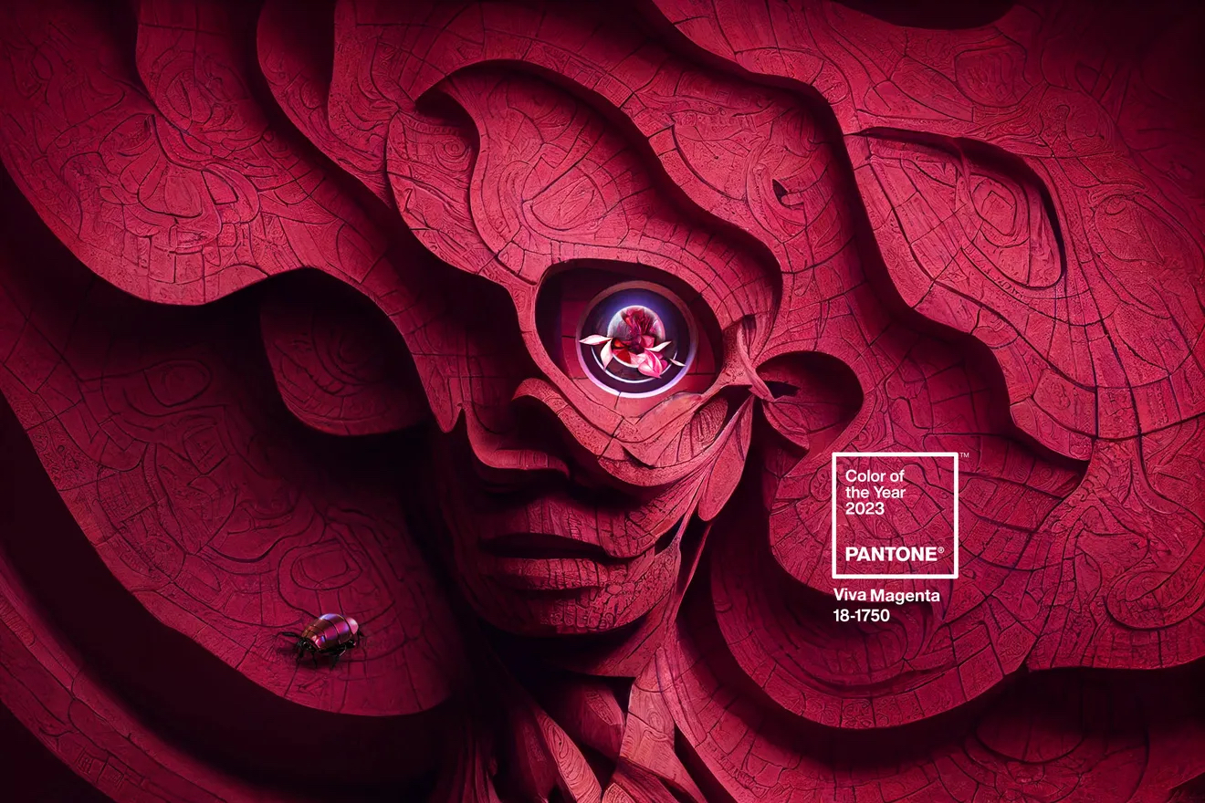
Viva Magenta by Pantone
The announcement of Pantone’s color of the year is highly anticipated each December. Pantone sets the standard of color matching universally so when you need to match that favorite vase, the PMS or Pantone Matching System can identify the exact hue. The Pantone color of the year influences all things design, including home decor. Pantone describes this years’ color as a “powerful, electrifying, and animated” red. A shade this bold is typically not seen as an accent wall but an accent piece can really add a pop to a room that just needs a little something.
Vining Ivy by Glidden
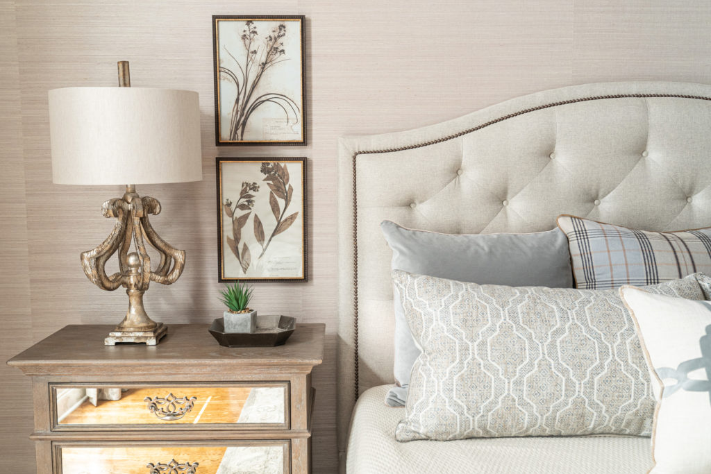
Greens and blues grew in popularity throughout this year, and the trend will continue into 2023. Vining Ivy is a lighter, muted aqua tone and draws inspiration from nature while adding a calming effect. This shade would serve well as an accent color for a living room or dining room and would also be beautiful if incorporated in a focal piece of furniture, bedding, or wall art.

Redend Point by Sherwin-Williams
With warmth and comfort being the central design theme for the upcoming months, Redend Point fits the bill. This hue is a blend of blush and beige with red undertones — a more Earthy version of the pinks you might have seen in the past. Sherwin-Williams brings an air of sophistication and class with their 2023 color choice. Put this inviting color in a foyer, entryway, or living room to welcome guests into your home, or create the perfect cozy bedroom by enveloping your space with accents of this cheery tint.
Blank Canvas by Behr
The name speaks for itself. Not just another neutral, off-white shade, this one serves as an excellent base to build upon for your ‘blank canvas’ room. Pegged as the most versatile of their white offerings, Behr Global Chief Marketing Officer, Jodi Allen calls this, “the perfect shade of white for any project.” (https://www.marthastewart.com/8313730/behr-color-of-the-year-2023-blank-canvas) Guaranteed to harmonize with any hue from bold and deep to bright and cheery. Utilize this color to bring a soft, calming effect to every room in your home.
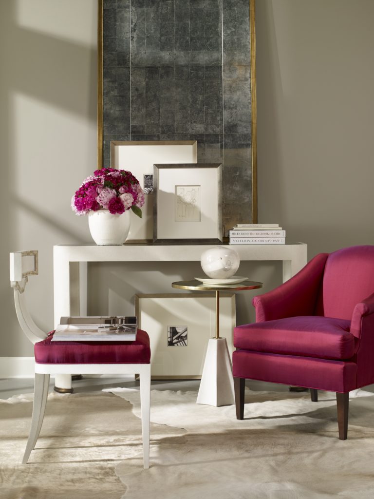
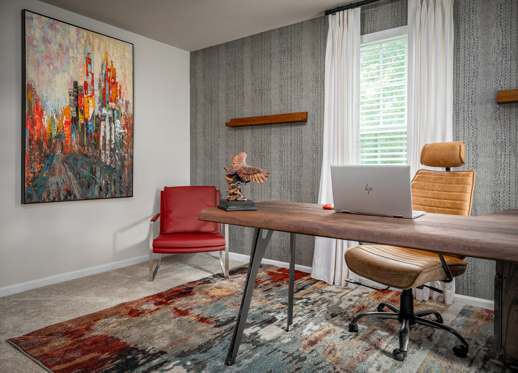
Alizarin by Graham & Brown
Keeping in line with exuberant warm shades is Graham & Brown’s color prediction, Alizarin. A deep and moody auburn shade that can be incorporated in any room of your home. With this color being brighter and a stand-out choice for your home’s interior, it’s the perfect solution for extra charm. Add this color to your space in the form of curtains, throw pillows, table runners or even a plush chair in your living room like below.
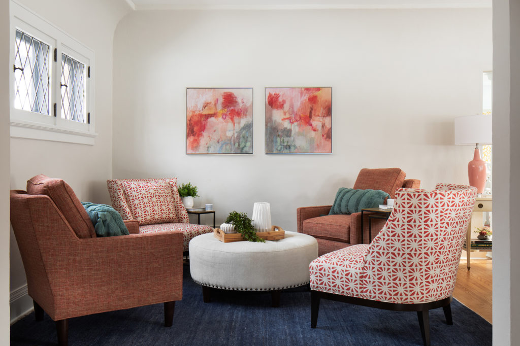
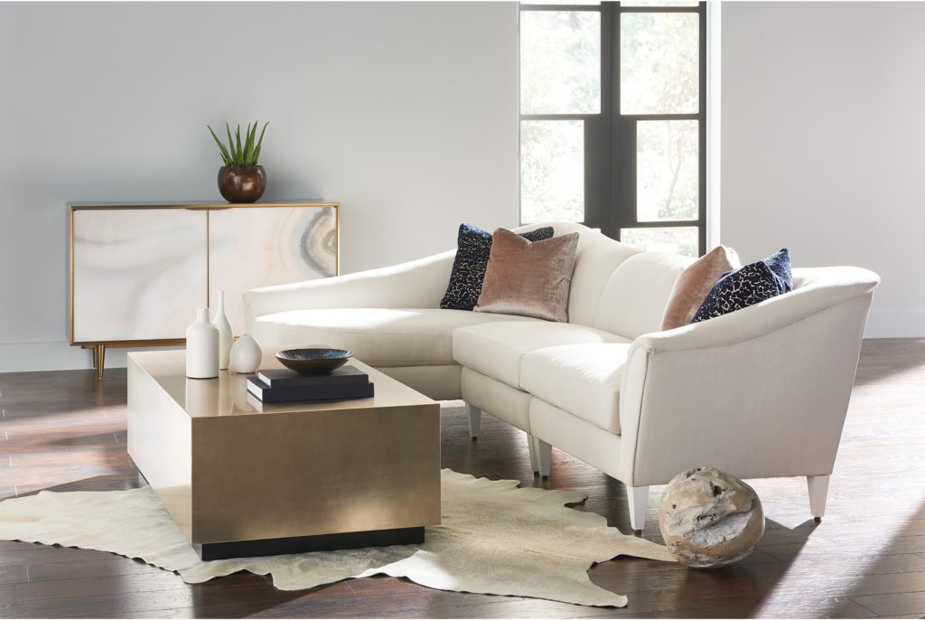
Raspberry Blush by Benjamin Moore
If your room is vying for more attention and zest, Raspberry Blush by Benjamin Moore is the answer. The red-orange color can energize a more plain or minimalist space by adding pops of lively tints. With this color being as bright as it is, be careful not to overdo it. Incorporate this shade in decor pieces and accent furniture like the side chair, rug and artwork in the example below. You can also tone down the space by balancing it with beige, whites, creams or even Behr’s “Blank Canvas” as mentioned above.
Other colors may be prevalent in the new year, but knowing the color direction that the design industry is headed is helpful for your own personal design choices. Take a look at these colors and truly decide if they’re shades that you’d like to have in your home. If so, let’s take a look at how to seamlessly introduce them.
How to Use Popular Colors
Whether you want to do a quick update to your design or completely transform your home, it can be fun to make adjustments to your room’s style. The problem is, how do you take the popular colors of the previous years, like grays and neutral tones, and add warmth? Here are some quick tips to get you started:
- Switch out your old comforter for a new one in shades of blush or green.
- Swap out white throw pillows for bright raspberry red or mossy green ones.
- Hang up new window treatments that can be the focal point of your room.
- Create a gallery wall with all the colors of 2023.
- Take some of your gray decor pieces and opt for a more bold and colorful option instead.
Michelle Jett Decorating Den Interiors Can Help
It’s not easy to seamlessly transition your home’s design with updated colors and decorations. Good thing our personal decorators understand color psychology — the study of human behavior in response to various hues — and can help you make your space an inviting haven for your specific family and friends.
Get in contact with our team today and we will work with you to get your house new year ready. We can’t wait to create your dream home!